
Study Shows Direct Correlation Between 5G Networks and “Coronavirus” Outbreaks
At last, the first study has emerged regarding the very clear relationship between “coronavirus” outbreaks and the presence of 5G networks. Thanks to Claire Edwards for making this available in English
======================================================
Study of the correlation between cases of coronavirus and the presence of 5G networks
Author: Bartomeu Payeras i Cifre1
Available at www.tomeulamo.com/fitxers/264_CORONA-5G-d.pdf
Translated from the Spanish by Claire Edwards
Date: March-April 2020
The COVID-19 pandemic and its effects in early 2020 have surprised scientists and politicians. If any study aimed at understanding the phenomenon and which consequently may help to clarify the causes of the pandemic is carried out, it should be promoted and/or taken into consideration. The correlation between cases of coronavirus and the presence of 5G networks has been addressed in alternative media and social networks. It is noteworthy that, at least in Spain, the media have not covered the scientific studies on the subject of 5G, nor asked the government any questions about this in the daily press conferences that it conducts to report on the state of the situation. The team of scientists advising the Spanish government has also failed to raise this issue.
It is common sense that the ability to demonstrate this correlation would be very important data to contribute to the understanding of, and the solution to, the problem.
Objective
To assess whether a correlation exists between cases of coronavirus and the presence of 5G networks. Without entering for the moment into subsequent cause-effect approaches in the case of positive results. Given that there is a sufficiently large statistical sample, it is possible for the results obtained to have a high level of reliability.
Material and methods
The study has benefited from the official statistical material published daily, which is a basic and valuable tool. It should be noted that in these publications, the methodology used for counting cases of coronavirus infections does not generally provide real data. In Spain and many other countries, it has not been calculated as there are not enough tests for such analyses. However, this does not alter the results of this study since it is based on the comparative rather than the absolute method of infection. Therefore, in order to avoid statistical error, we will compare the density value of confirmed cases of coronavirus (expressed in number of cases per 1000 inhabitants) instead of absolute values. Since the criterion for counting used by the health authorities within the same state or city is the same, the comparison of published values for different cities or regions will be equally reliable for statistics. Comparisons between different countries of confirmed cases, excluding asymptomatic cases, will be equally reliable. The possible exception of some non-transparent country that could manipulate the publication of its data is beyond the control of this study.
The method used was to compare the incidence (no. of cases per 1000 inhabitants) between countries with and without 5G technology. Between regions of the same country with and without 5G technology. Between cities of the same state with and without 5G technology. Between different neighbourhoods of the same city with the 5G network map of that city. Comparing states with common borders with and without 5G technology. Comparing the case of one state within another, as is the case of San Marino.
– The data for each chart were taken on the same day. Graphic results and data published below:
-
-
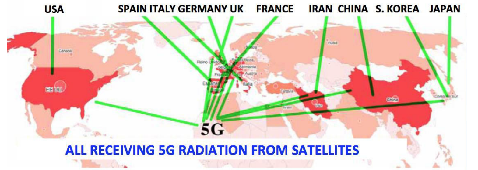
Chart of the 9 countries with the most infections worldwide.
-
Chart and rates of infection of the 5 countries with the highest incidence in Europe.
-
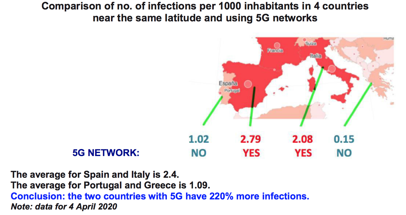
Chart and rates of infection of 4 nearby countries at the same latitude: Portugal,
Spain, Italy, Greece.
-
San Marino: comparison of rates of infection with Italy and Croatia.
-
Italy: Incidence chart and 5G network.
-
Spain: 5G coverage chart and rates of infection.
-
Barcelona: Charts with 5G coverage and rates of infection.
-
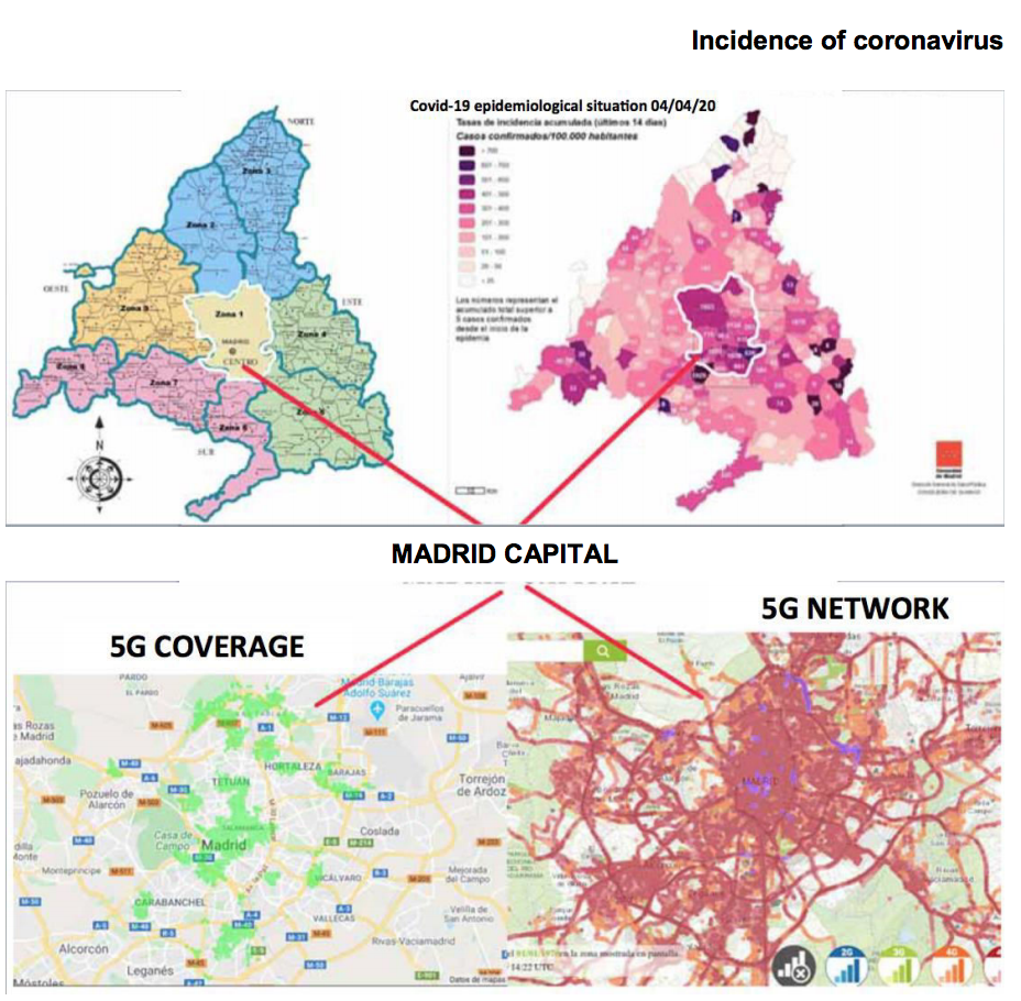
Madrid: 5G coverage charts and rates of infection.
-
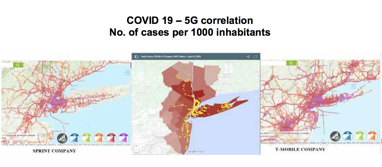
New York: coronavirus incidence chart and 5G network.
-
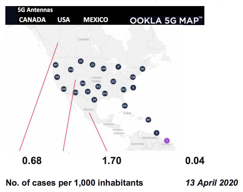
“Border effect” between Mexico and the USA.
-
Canada, USA and Mexico: chart of 5G networks and rates of infection.
-
Africa: 5G network chart.
-
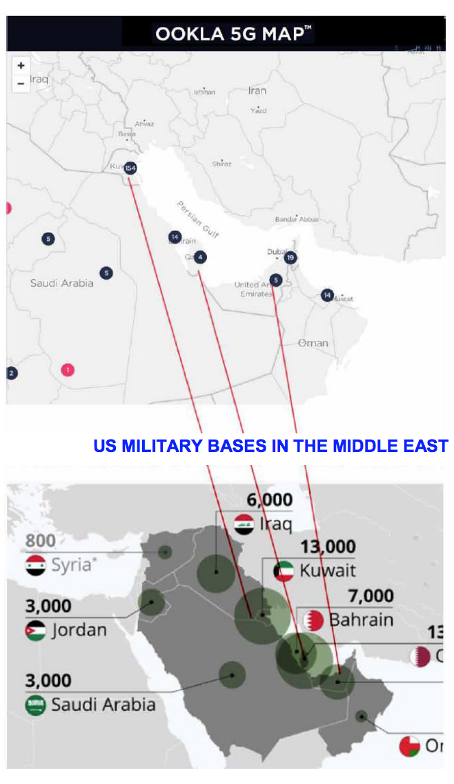
Persian Gulf: 5G network and US military bases.
-
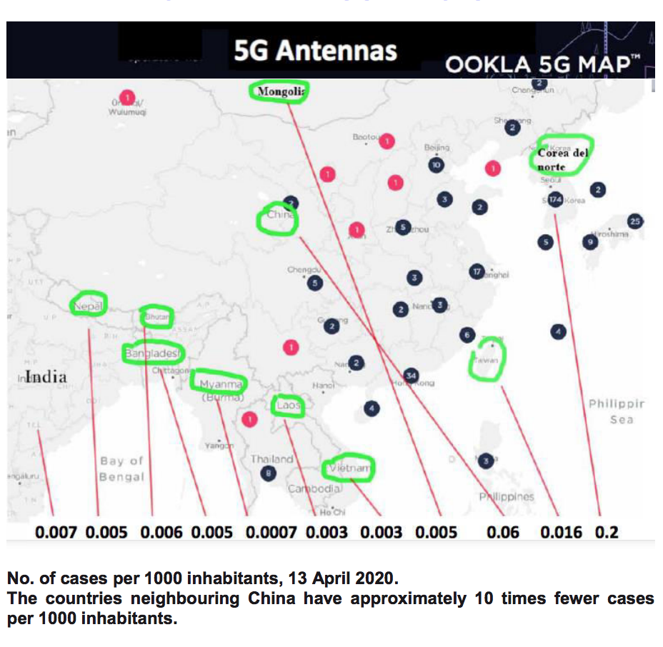
Chart and rates of infection of China and neighbouring countries.
-
1. CHART OF THE 9 COUNTRIES WITH THE MOST INFECTIONS WORLDWIDE
2. CHART AND RATES OF INFECTION OF THE 5 COUNTRIES WITH THE HIGHEST INCIDENCE IN EUROPE

3. CHART AND RATES OF INFECTION OF 4 NEARBY COUNTRIES AT THE SAME LATITUDE: PORTUGAL, SPAIN, ITALY, GREECE
4. SAN MARINO: COMPARISON OF RATES OF INFECTION WITH ITALY AND CROATIA
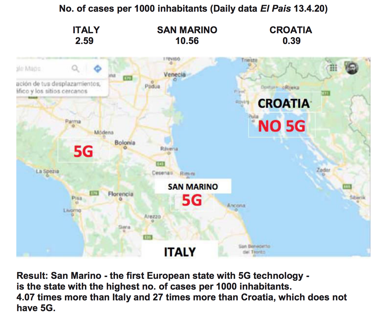

“Why San Marino? Because the self-contained nature of the state, and its relatively few restrictions on the use of radio frequency makes it the ideal place to test the latest development in telecoms connectivity.
“Telecom Italia intends to double the number of its mobile sites within the country and will additionally install a network of small cells in downtown San Marino.” https://www.fircroft.com/blogs/s an-marino-set-to-become-the- first-5g-country-72001910124
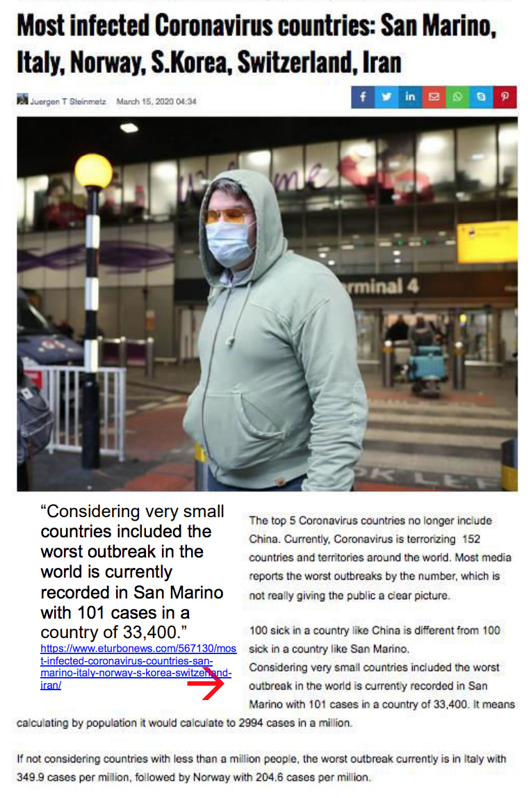
“Considering very small countries included the worst outbreak in the world is currently recorded in San Marino with 101 cases in a country of 33,400.”
5. ITALY: INCIDENCE CHART AND 5G NETWORK

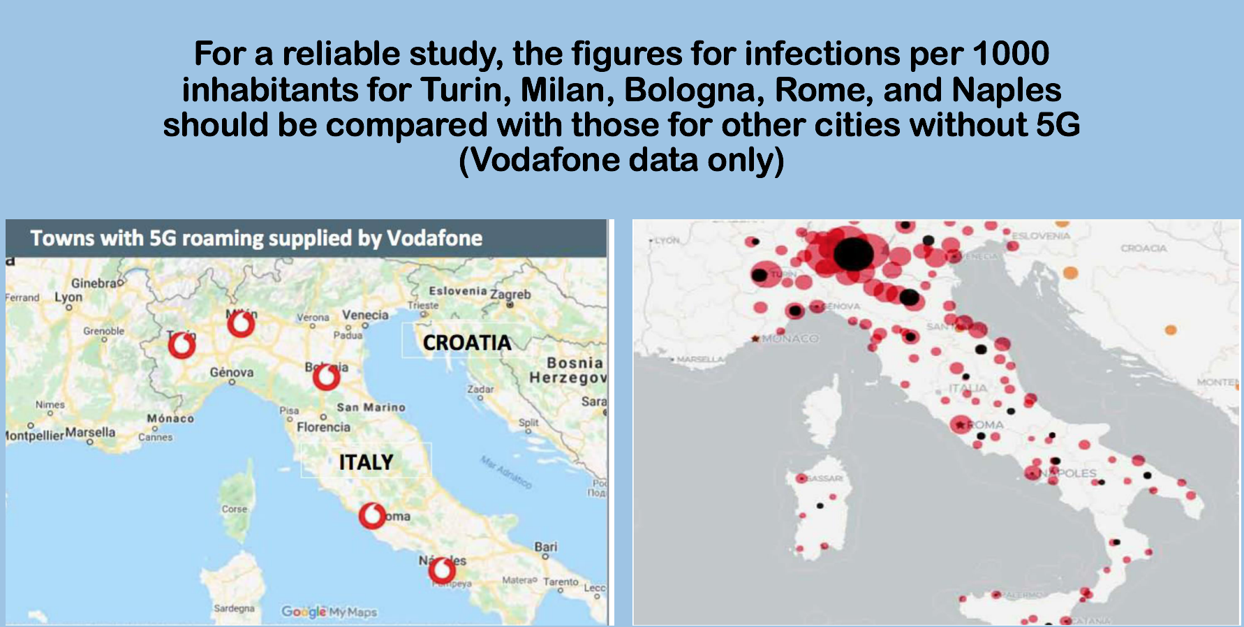
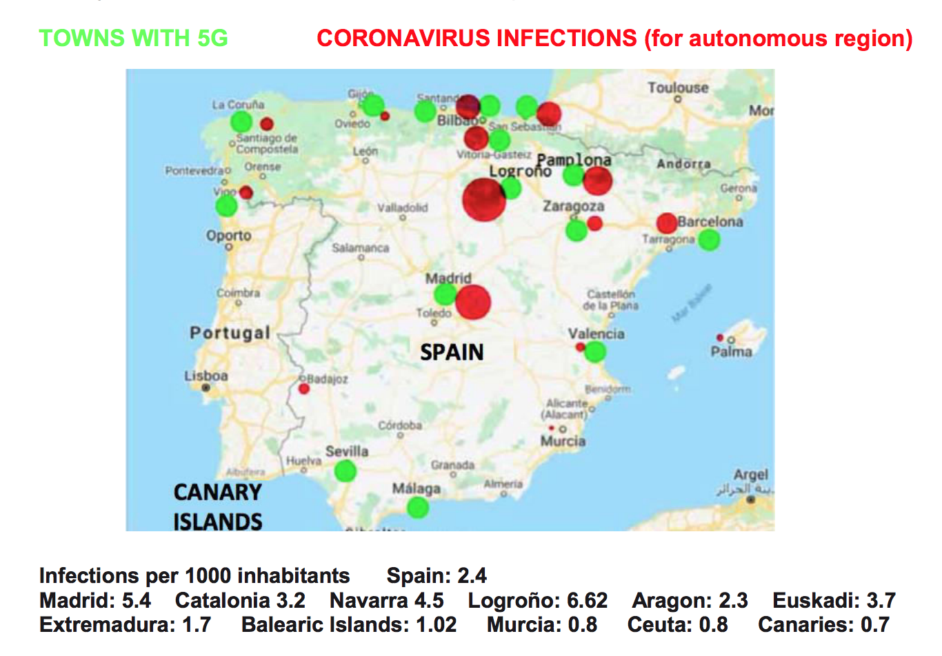
6. SPAIN: 5G COVERAGE CHART AND RATES OF INFECTION
Data for cities with 5G should be related to the number of infections in those cities. Since data by city are not available, the comparison has been made with data for autonomous regions. This causes the data of the capitals to be diluted with those of their region.
This is why the comparison in autonomous regions with one or two provinces is more significant: Extremadura, Murcia, Madrid, Navarra, Rioja, Balearic Islands, Asturias or the Canary Islands. Also in Euskadi since the three capital cities have 5G.
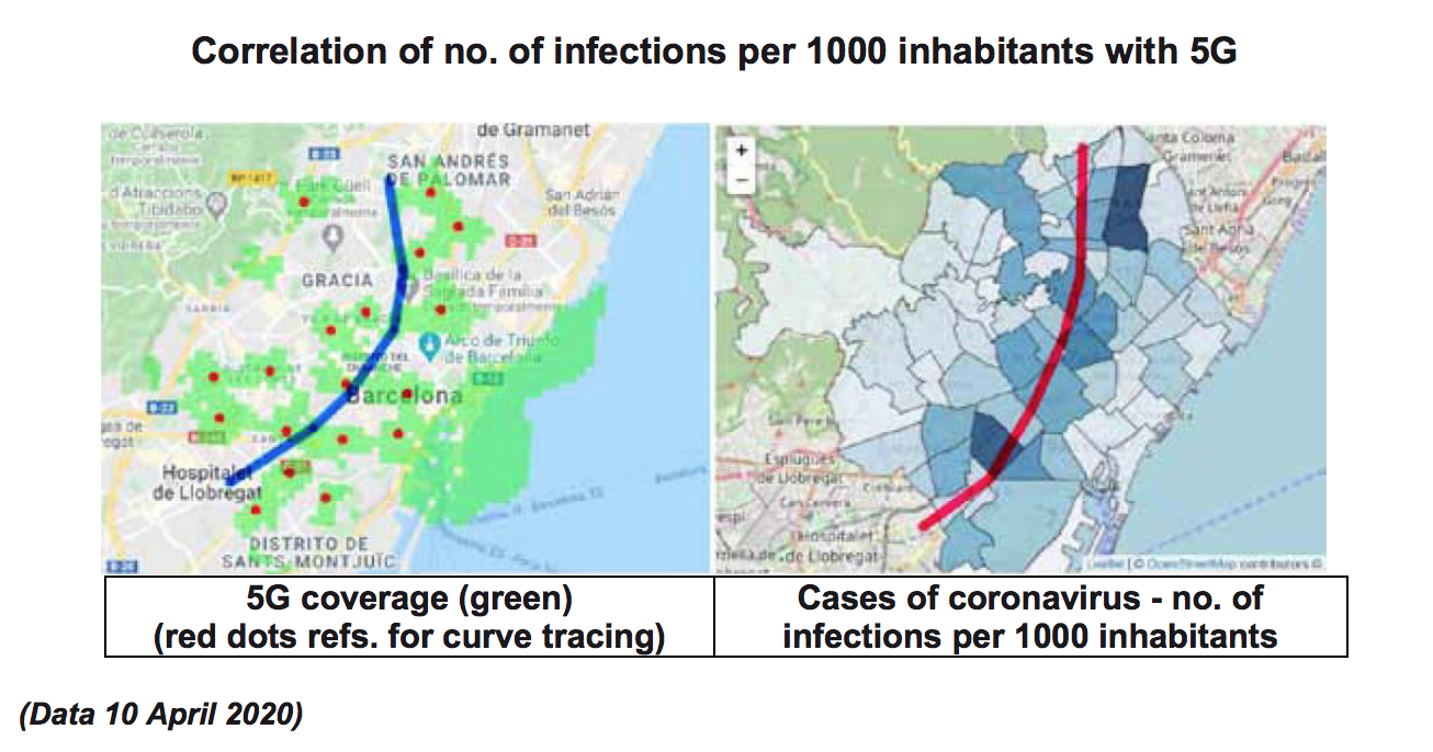
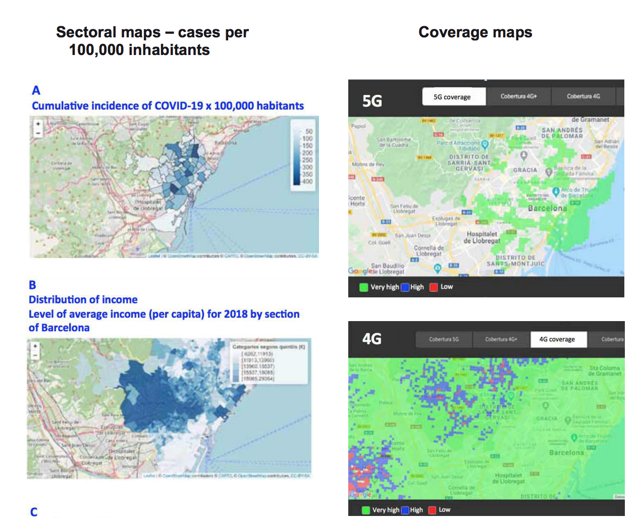
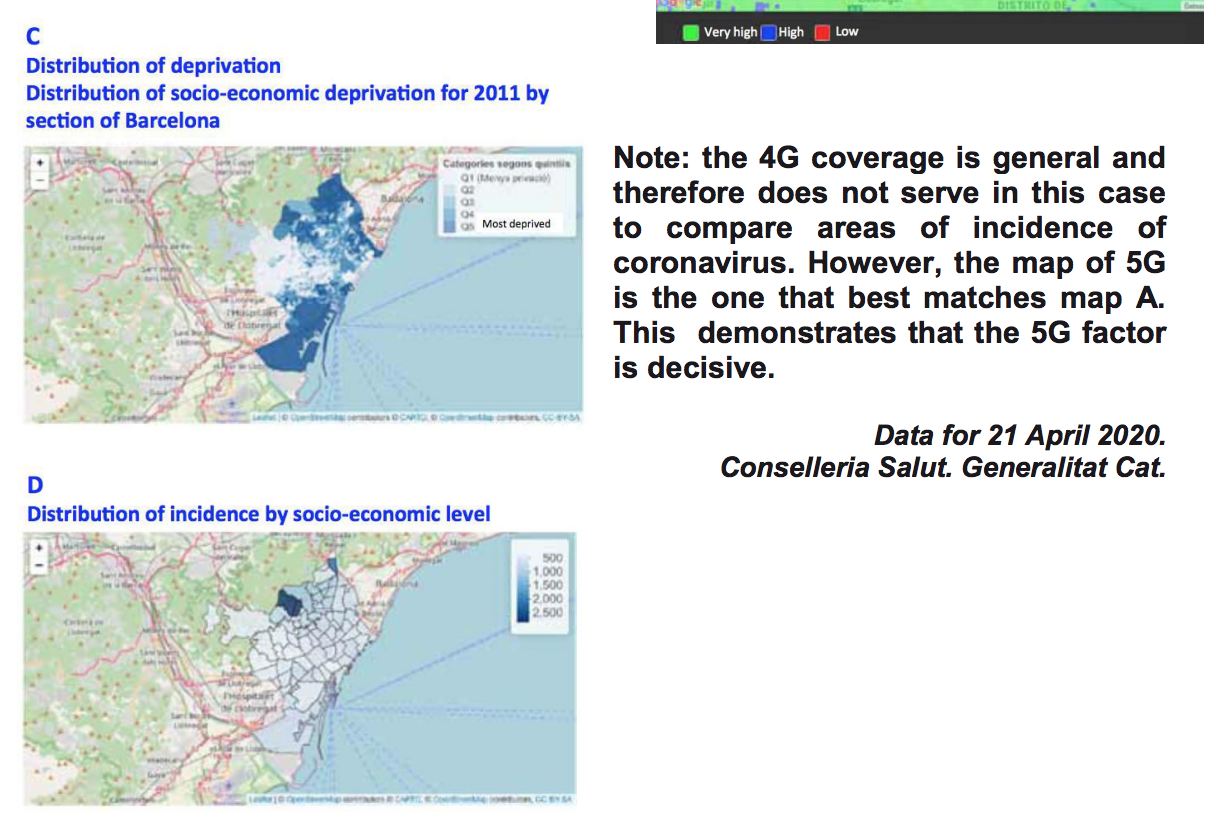
7. BARCELONA: CHARTS WITH 5G COVERAGE AND RATES OF INFECTION
8. MADRID: 5G COVERAGE CHARTS AND RATES OF INFECTION
9. NEW YORK: CORONAVIRUS INCIDENCE CHART AND 5G NETWORK
10. “BORDER EFFECT” BETWEEN MEXICO AND THE USA
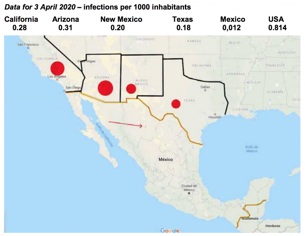 The average for the 4 US states is 0.242, which is over 2,000% more than Mexico.
The average for the US is 0.814 or 7.000% more than Mexico.

11. CANADA, USA AND MEXICO: CHART OF 5G NETWORKS AND RATES OF INFECTION
12. AFRICA: 5G NETWORK CHART

13. PERSIAN GULF: 5G NETWORK AND US MILITARY BASES
14. CHINA AND NEIGHBOURING COUNTRIES: CHART AND RATES OF INFECTION
Results and discussion
To know whether or not the result obtained is that of a random phenomenon, a statistical analysis of the results of an experiment must be carried to calculate the probability of the event occurring. The probability calculation is obtained by dividing the number of favourable cases by the number of possible cases. If the result shows that it is not a random phenomenon, it shows sufficient causal reason to analyse the causes.
To eliminate any upward errors we will always opt for the most conservative numerical option.
Let us therefore calculate the probability of three of the examples analysed above.
(a) Probability that the 9 most contagious countries on the planet are countries with 5G networks.
There are 194 countries on the planet. As of 6 March 2020, according to GSMA, there are 24 countries with 5G technology.
Pr = 24/194 x 23/193 x 22/192 (nine times in total) = 0.1237 x 0.1191 x 0.1145 x 0.1099 x 0.1052 x 0.1005 x 0.0957 x 0.0909 x 0.0860 = = 1.47 x 10 (high -9 ).
The probability is 1 in 680,000,000.
If we include Japan, which also has 5G and rates of infection similar to those of South Korea …the probability is 1 in 8,500,000,000.
(b) Probability that the 5 most contagious countries in Europe have 5G networks.
There are 49 countries in Europe, among which it is currently difficult to know if they currently deploy 5G, as there are 5 that have declared a moratorium, and many others do not have operational networks although companies publish as if they were already operational when they have signed agreements. We will calculate it downwards, as a conservative option, we will assume that about 15 countries have operational 5G systems.
Pr = 15/49 x 14/48 x 13/47 x 12/46 x 11/45 = 0.00157.
The probability is 1 in 637.
(c) The case of San Marino is highly significant. It is located within the Italian territory, with a similar culture, economy, and social level, but presents much higher rates of infection. The only difference is the time of exposure of its citizens to 5G radiation, because it was the first state in the world to implement such technology on 4 September 2018, while in Italy it was 5 June 2019. This opens the door to debate about the likely influence of 5G on the increase in the rates of infection.
Pr = 1/194 x 1/194.
The probability is 1 in 37,636.
These figures are eloquent enough to make calculating the other cases unnecessary.
The results for the city of Barcelona (pp. 7-8) indicate that sociological factors do not have a significant influence on the rates of infection, but if we see a clear relationship with the 5G coverage map, which added to the 4G coverage, gives us a correlation between mobile coverage and the proportion of cases of coronavirus. If more data were available, this study should be extended to other cities.